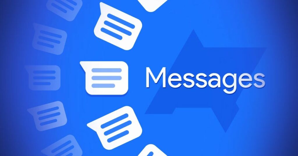
Google is rolling out new icons for the SMS/RCS app, as well as for Phones and Contacts. They are also adding a few new features to the Messages app.
Update (10/21): With version messages. android 20221018 01 RC00.phone.open-beta dynamic, Google is already rolling out the new Messages icon. It’s also live on Wear OS, and here is where you can sign up for the beta.
As expected, the blue icon is on a light background that doesn’t stand out too much. Even Google Chat has an animated splash screen, but there isn’t one here. Also, the animation from Google’s promotional video doesn’t show up today.
The Themed icon on the other hand is better and a little bit easier to recognise, even though its logo is simpler.
10/20 in the original version: These three icons continue to share the same style to show that they are part of the same app family that is responsible for communication. The major pattern here is overlapping message bubbles, which represents how texting (and calling) entails participation from at least two people in the conversation. This resembles the green Google Chat logo in its appearance.
There are also two more shades of lighter blue that are employed, in addition to a darker shade of blue that is used where that overlap occurs. As a consequence of this, there is an illusion of shadow-derived depth, which is extremely uncommon in the iconography of recent Google products.
When it comes to the icon for Google Messages, the colour blue was chosen because it is the default bubble colour for RCS (Rich Communication Services) and was also chosen to maintain continuity and user familiarity. It is an easily identifiable emblem, but the portions that overlap one another, particularly at the bottom-left and upper-right, give it an appearance that is somewhat sloppy and imprecise.
You can also read about these latest tech-related articles:
- Pixel 7 Pro Vs. iphone 13 Pro Max: Google’s New Flagship Takes On An Old Foe
- Google Play Store Shuts Down A Hack That Lets You Make Instagram Ads-free And Customise It
In the meanwhile, the new symbol for the Google Phone app is pretty attractive, and the Contacts app is uncomplicated and easy to understand, even though the lighter shades of blue appear to be armed rather than what is probably intended (people side-by-side).
If you position these icons on a bright background rather than a dark blue one, you may find that they stand out less in comparison to the icon set that is currently in use. The overall effect is more stylised and less realistic.
According to Google, these icons are intended to be used in conjunction with other first-party applications, and “each is designed to adapt to Material You themes.” The flatness and absence of shadows that can be observed in the Workspace icons are present. However, another connection that may be made is to the icon family used by YouTube and its very muted colour palette.
The new icons for Google Phone, Messages and Contacts are going to start appearing all over the place over the coming few weeks.
Stay connected to our homepage journalistpr.com for more such updates.

